In this weekly update, I would like to talk about game’s difficulty, options and UI.
The modern notion is that game’s options should be as simple as possible. It is even preferable if a game has no options at all, which is often the case for browser and mobile games. While I see some validity in this point of view, I simply can’t embrace it. For me, exploring various menus, ways of tweaking a game, was always a pleasant part of experience, especially when it comes to difficulty options.
Through the ages, games usually had just one general difficulty setting: Easy, Medium, Hard and variations of thereof. For gamers, those options were opaque: they certainly changed SOMETHING in game, but what exactly was anybody’s guess (a few authors, usually in RPG and strategy genres, actually provided some explanation, but not always).
However, I’d like to remind you of a few games that did things differently.
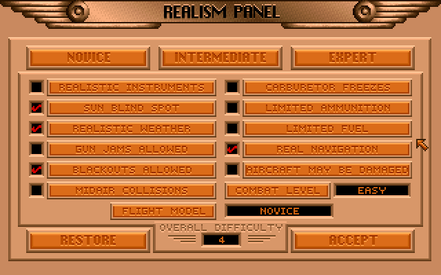
In Dynamix’s “Red Baron” and later simulations (“Aces over Pacific”, “Aces over Europe” and, of course, “Aces of the deep”), you could tweak your gemaplay in pretty much every way possible. If you wanted, you could enabled all the checkboxes, but “Aircraft may be damaged” and get a game, where controls were more realistic and you suffered from gun jamming, but your plane could never be shot down. Or you could choose any other set of options, one that allowed you the most fun.
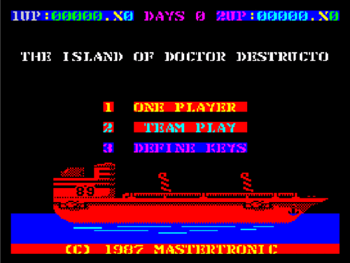
That’s why for my own games, I prefer to offer larger than usual amount of difficulty options. So, while the original Island of Dr. Destructo had a very simple main menu, which allowed you to start a new game or define keys, menu structure for Return of Dr. Destructo is… a little more complex:
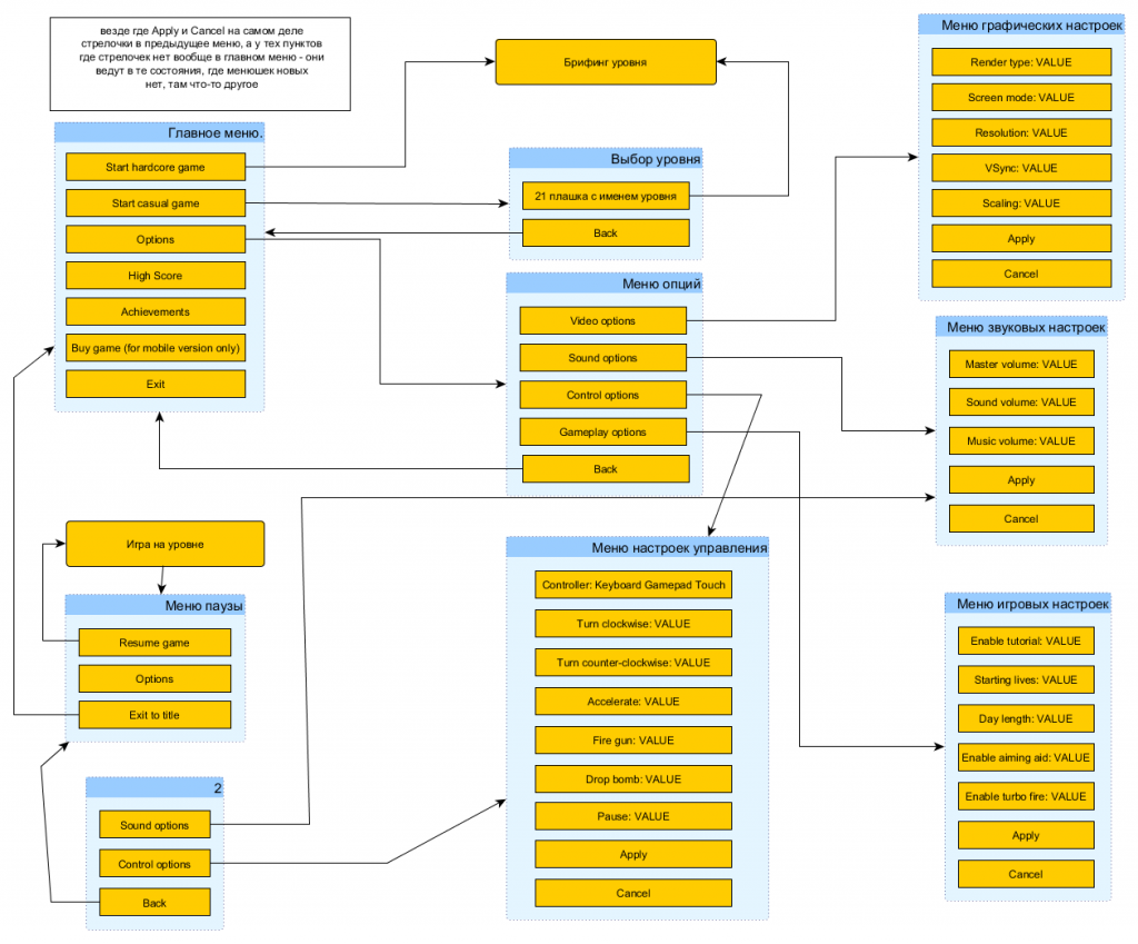
Yeah. Don’t be intimidated, though. It’s just a working diagram, and it’s somewhat confusing. In reality, you won’t be seeing more than one menu at a time, with five or six options at most, which is still a lot, compared to most modern games, but just right by me.
However, dealing with so much options leads to task of designing a beautiful and usable UI to browse and change them. Originally, I used very simple text-based menus everywhere:
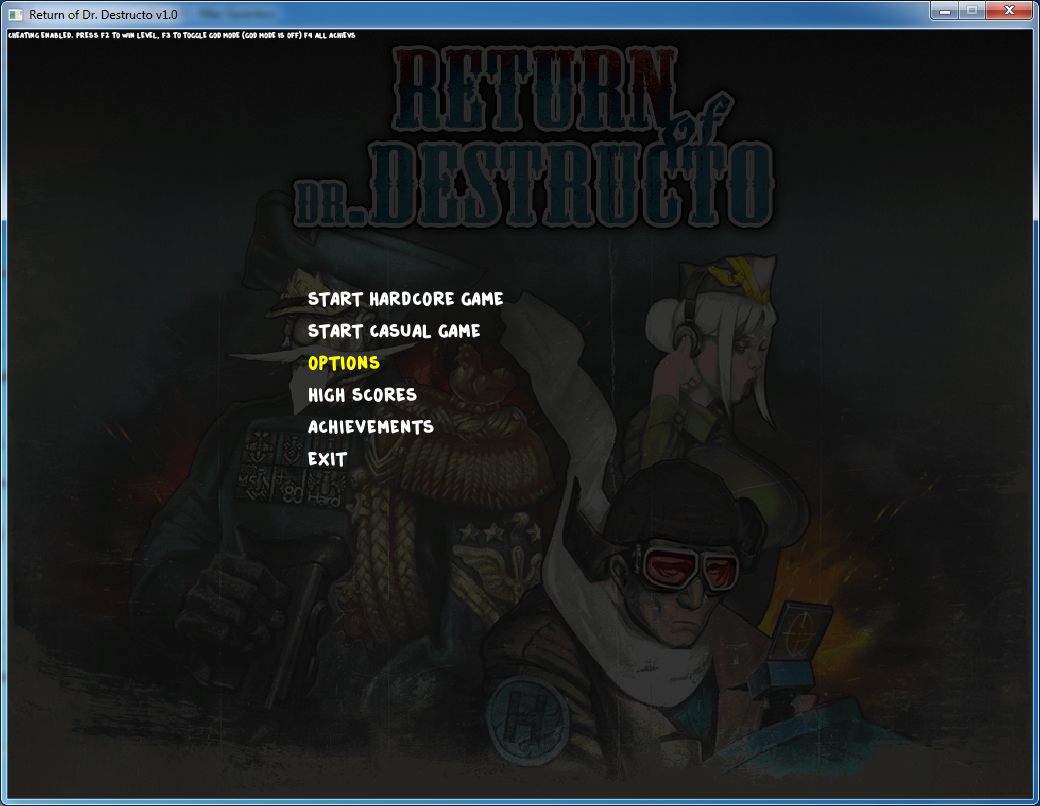
But that’s not what I wanted for the final game, especially for mobile versions, where I felt it is necessary to provide players with distinct buttons to click on. That’s why Oleg worked hard to create a new menu UI.
Unfortunately, this work is still in progress and I can’t offer you a screenshot of the final result here. But let’s take a look at some work-in-progress concepts we went through:
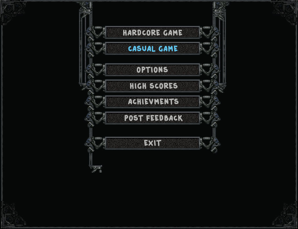
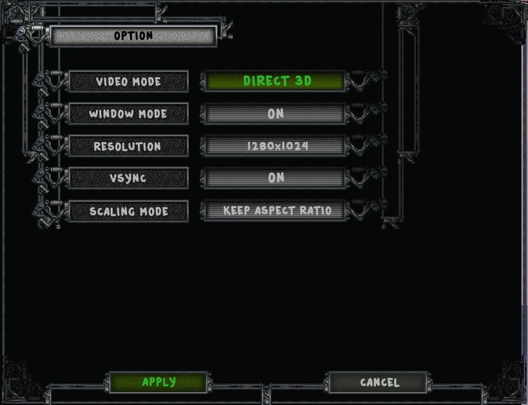
Something a lot like the last image is going to end up in the actual game. I’ll need to make some significant changes to my menu code to make it all work, because it’s a piece of legacy that isn’t good for anything but text-based fixed-width single-column menus. But I think it’ll worth the troubles.